Evolution
With an image that is according to current times, we at UDEM respond to present and future educational challenges, we reinforce the value of our brand outside and enhance the feelings of pride and belonging inside.
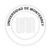
Our seal
The highest expression of our institutional identity.
This is our university seal, not our logo. Let us avoid this small semantic misstep. Our shield is an asset that must be protected and used meticulously to give authenticity, authority, and official recognition to a document or event.
A circular layout that contrasts thick and thin lines evenly. The name of the University occupies the main reading position in the shape of an upper arc and it is complemented in the lower part with the phrase “Homo Hominis in Ministerio Perficitur”, which means “Man is Perfected in the Service of Man.” The three historical books in the seal appear in the center, graphically refined and crowned with two mirror-image laurel wreaths. Symmetry and order.
Anatomy

Books
The three books represent the Institution’s experience, knowledge, and high academic level. Together, they form the initials “U” and “M”, as a reference to the initials of the Institution.
Universidad de Monterrey
The name of the Institution: “Universidad de Monterrey”, appears in the main reading position in capital letters that form a semicircle in the upper part of the seal.
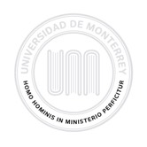
Founding principle
The phrase “Homo Hominis in Ministerio Perficitur,” which means “Man is Perfected in the Service of Man” appears in the lower arc of the circle. It conveys the spirit and calling of those who are part of the Institution to put their talent and knowledge at the service of the community.

Twin laurels
Two mirror-image laurel wreaths surround the books as a crown. They represent the harmony between our graduates’ professional success and their personal success.
Permitted uses
It is used in official documents such as professional degrees and diplomas, as well as on lecterns, façades, stoles, and PEF covers.
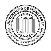
White background
It is used in official documents such as professional degrees and diplomas, as well as on lecterns, façades, stoles, and PEF covers.

Yellow background
It is only used in the various lock-ups.

Black background
It is used in official documents with a Pantone Black 7 / CMYK 0, 0, 0, 80 / Black background.
Full logo (Lock-up)
A lock-up is a graphic unit that ensures the correct use of the positions and scales of the elements that make it up. The lock-up of the Universidad de Monterrey is made up of a yellow plate, the university seal, a black plate, and the official name of the Institution. These elements maintain a special relation with one another and they must not be altered.
The full logo is applied only on institutional stationery and leaflets and installations within the University. It must be applied on a white background, except in promotional brochures, and it must be located in an outstanding position within the structure of a document, on the right-hand upper corner. The only exception to this is the location of the logo in the Institutional Website.
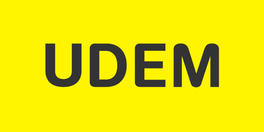
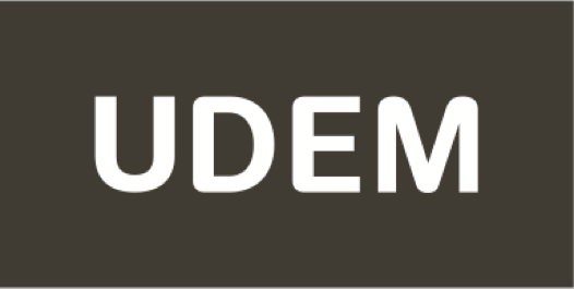
UDEM Logo
Our logo shows the acronym UDEM in the center, in matte black, over a bright yellow plate. The proportions of negative space upwards and sideways are equivalent. This allows for the protection of our logo and projects high visibility, especially in long-distance applications.
Download the Quick guide to the correct use of UDEM’s Identity
Uses
Main logo
This is the most frequently used version. It must be applied with the protection area visible in any material whose background is different from the plate’s, or on seamless background paper, Pantone Yellow exclusively. It must always be placed on the upper right-hand corner.
Secondary logo
It is used in publications with Pantone Yellow background and also on seamless background paper, Pantone Black 7, always respecting its protection area. It must always be placed in the upper right-hand corner.
Colors
The colors of UDEM’s Identity are yellow and black. Below, we present the color variations for its use in printing or for digital use:

Yellow - digital use
RGB: 255 - 245 - 0
HEX: #FFF500

Black - digital use
RGB: 51 - 51 - 51
HEX: #333333
Centro Roberto Garza Sada (CRGS)
Un logotipo y un sistema de comunicación especial representan al Centro Roberto Garza Sada de Arte, Arquitectura y Diseño.
Su uso es exclusivo de las Escuelas relacionadas a Arte, Arquitectura y Diseño de nuestra Universidad, y no debe ser utilizado en otro espacio diferente. El logotipo debe mantenerse proporcional al Logotipo UDEM. Se utiliza únicamente en positivo o negativo, con mayor libertad en composiciones y colores, pero siempre acompañado de la Pleca UDEM, preferentemente en blanco o negro, o en amarillo para una comunicación más institucional.
Ver más información para el uso correcto del Logotipo del Centro Roberto Garza Sada (CRGS).
Logotipo Prepa UDEM
Es el elemento principal de marca de la comunidad Prepa UDEM. Debe utilizarse en toda la comunicación interna y externa de Bachillerato.
Ver más información para el uso correcto del Logotipo Prepa UDEM.
Logotipo ExaUDEM
Es el elemento principal de marca de la comunidad ExaUDEM, para exalumnos y de nuevo ingreso. Debe utilizarse en toda la comunicación interna y externa de la comunidad ExaUDEM.
*La forma correcta para hacer referencia a la marca en un escrito es: ExaUDEM.
Ver más información para el uso correcto del Logotipo ExaUDEM.
Troyanos
Representa las distintas disciplinas deportivas de la UDEM, otorgando a cada deporte su propia identidad con la misma línea gráfica. Su propósito es generar un fuerte sentido de pertenencia entre todos los estudiantes, promoviendo la integración y el apoyo de toda nuestra comunidad universitaria. Un emblema con el que todos los miembros pueden identificarse y sentirse parte de la Universidad.
Ver más información para el uso correcto del Logotipo Troyanos.
Logotipos Multimarcas
Resuelven necesidades específicas donde la Universidad apoya, respalda o participa junto a otras marcas. Cada versión tiene características únicas que ayudan a representar a nuestra Institución de mejor manera y con mayor impacto según las necesidades o especificaciones del material en el que se aplicará.
Ver más información para el uso correcto de Logotipos Multimarcas.
Any use not mentioned on this page will not be allowed.
The use of the shield without prior authorization from the Office of Marketing is strictly prohibited. For any query on the correct use of the shield, please write to [email protected].